Friday 30 September 2011

Research 3 // Evaluation

Research - 


I have gathered extra research on some existing type and image designs from www.ilovetypograhy.com


The use of this text on each design has given me ideas to develop. I feel that this image to the left is very interesting. The type changes as the image develops. I feel that using different sizes and layouts then it develops the ideas more. This relates to my brief in a positive way also. As i will be sampling and playing around with type size and format. 


Evaluation : 


I feel that is project has gone quite well. It has pushed me, as i am not confident with type nor drawing, but i feel i could develop further. The use of developing my research to my initial ideas to my final designs has given me an idea of what this project was about. It feels like i have achieved some more knowledge on this aspect of design. 


The step by step plan i think is a useful concept. The end set of letters i designed i feel does translate the meaning of the word dissolve. I don't feel like they are my best pieces of work but i have learnt a lot about the procedure and actually designing a letter form and not just using it.


Overall i feel that my work went ok. I stuck to the deadline and added aspects to my blog but if i had more time i would of developed the designs and put more time into each letterform to get the best outcome. 

Research Two//

I was browsing through the internet and touched on a few sites which i have found useful for the typography ideas for my own designs . I used www.ilovetypography.com and www.ffffound.com i also looked at other various sites such as www.booooom.com. These sites are useful for me to get ideas and inspiration. The typefaces are eye-catching and visually they look and feel well designed. 


I really feel that these two designs are eye-catching and i would like to take ideas from these to develop my text. The use of black and white also helps me to generate ideas for the brief we were set with black and white as our only colours. 


The images here from ffffound.com i think highlight the simplicity of typefaces. I really can see how structure starts to define a typeface. The use of using block lettering adds to the whole feel of  the simplicity. 

Wednesday 28 September 2011

Initial Research // Ideas /

Alphabet Soup // Visual Thinking

Brief: To produce a series of 10 variations of a single letterform that communicates my own interpretation of a randomly selected word. The final pieces should be based on existing letterforms, completely hand-rendered and in black and white.
Random word: DISSOLVE
 
Research:
1. To cause to pass into solution: dissolve salt in water.
2. To reduce (solid matter) to liquid form; melt.
3. To cause to disappear or vanish; dispel.
4. To break into component parts; disintegrate.
5. To bring to an end by or as if by breaking up; terminate.
6. To dismiss (a legislative body, for example): dissolved parliament and called for new elections.
7. To cause to break down emotionally or psychologically; upset.
8. To cause to lose definition; blur; confuse: "Morality has finally been dissolved in pity" (Leslie Fiedler).
9. Law To annul; abrogate.
v.intr.
1. To pass into solution.
2. To become liquid; melt.
3. To break up or disperse.
4. To become disintegrated; disappear.
5. To be overcome emotionally or psychologically: I dissolved into helpless laughter.
6. To lose clarity or definition; fade away.
7. To shift shots in a motion-picture film or videotape by having one shot fade out while the next appears behind it and grows clearer as the first one dims.
n.
A transition in a motion-picture film or videotape made by fading out one shot while the next one grows clearer. Also called lap dissolve.
 
Initial Ideas: - Letterform could be enhanced then removed, or sectioned into tiny sectors
- Lines to represent melting - spertaion // fade away - layers
- Extracts placed over like layers have dissolved
 
Typography Research:
I have looked at some different typograhy as research before I start my initial sketched into my designs. I feel that using the word dissolve is quite useful in typograhy as quite alot can relate to it. Although we have to use an exsisting typeface i feel that i can enhance and tweek the designs i look at.


Tuesday 27 September 2011

how good is tho layout, yup thats all i have to say - type - amazinnnn

www.ffffound.com
I LOVE love love mario wagners work. I feel that his use of collage is so so amazing. He links images of old and new and adds/blends some amazing links too them. His use of colour is also highly creative. I love collage and his designs are so up keeping with how life has developed and how images i feel, should look.

I normal am not drawn to illustration that much but recently i have been loving it. the layout of this from dontpanic.com really interests me, Using text and image so closely i think looks very effective. The illustrations are quite sketchy and not perfect which is very good in my opinion as i don't feel that illustration should be perfect. I like how the illustration is in keeping with the form of the poster and the message it is trying to get out. 
 @ Cocaine - Clare _maillisom_web

I love this image and found it on ffffound.com, I love the symmetry and the colour scheme and how it is in keeping with a vintage and shape vibe. The layout of tis image really appeals to me, its quite unique and not structured in the normal way for this type of design. i am into a lot of vintage things and this use of faded, dull and badge colour scheme really appeals to me as i love simplicity with image.


typography in my eyes is a strong pice of a designers work. the use of this can determin how strong or how soft a piece of design can look. I love how this type resembles a map and the use of different spaced and sized lettering adds to how vibrant the piece is. The message is clear and the the poster is extremely eye-catching and works well with black and white which one again is simple but defiantly adds to the image.


I have selcted these pieces of work to portay some styles of Grpahic Design I like. I have many designs//styles// likes I feel i could get inspired by. I have picked these examples to show the main aspects of design i love - Typography - Illustration//Format and Collage//Shapes/Layout etc. I feel that by using these basic skills by design work could develop.

Friday 23 September 2011

TimeTable research

Timetable Research

Kate researched into the college timetable, so we know what days and times students would be in college, we can also plan other things around these times once known:


For the 'How to' research I looked into the college timetable so we could fit our app around the Graphic Design BA first year timetable. This was obviously an important factor as the app had to coincide with our timetable.  I found the dates that run through out the year and a weekly timetable.


12th september-  Induction programme- Enrolment and introductory briefings


19th september - 24th october: first semester 
OUGD401 Brief-Part 1
OUGD402 Brief-Part 1
OUGD403 Briefing
OUGD404 Briefing
24th October-31st October TUTORIAL/ RESEARCH VISITS WEEK
31st October- 19th December:
OUGD405 Briefing
19th December - 2nd January CHRISTMAS HOLIDAYS
2nd January- 13th February:
Submit part 1
13th February- 20th February RESEARCH VISITS WEEK
20th February - 2nd April:
Brief- Part 2
OUGD406 Briefing
2nd April- 16th April EASTER HOLIDAYS
Submit part 2
30th May
OUPD101 PPD1 PRESENTATIONS (assessed)
ASSESSMENT and show preparation
18th June: END OF YEAR SHOWS
ACADEMIC YEAR ENDS 22/06/12


Weekly timetable:
Monday 9:30 - 4:00
Tuesday 9:30 - 4:00
Wednesday: Studio Development
Thursday 9:30 - 4:00 (evening introductory classes for things like photography will also take place on thursdays)
Friday 9:30 - 4:00
Saturday: Studio open from 10:00 - 4:00

Thursday 22 September 2011

Existing Apps Research

1. Classes - Timetable
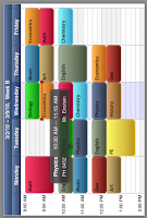
Classes is a smart timetable for school and university. Immediately after starting the app, the next class is displayed with all relevant information. On rotating the device, you are presented with the complete timetable in landscape mode. Classes shows all the information you need when you need it.

2. SchoolBook
SchoolBook puts your plain old high school timetable onto your iPhone and iPod touch. It tells you what classes you have and thats it; its the ultimate no-frills approach to a digital timetable.


iPlanLessons
Lesson planning for home schoolers.  
 
4. Calendar+
Scroll seamlessly through your events on your iPhone, iPod Touch or iPad. Calendar+ gives you a fantastic overview of your events and a quick nudge up or down will move you instantly and seamlessly - no more waiting for the next week or month to 'load'.


SaiSuke has various view models allowing you to see your calendars in a daily, weekly, or yearly views. You can get a perspective schedule for the month using the month view, which allows you to see appointment titles in a monthly styled calendar.
 
http://www.apple.com/uk/iphone/ - All images taken from this site.
 

Voice Recording

As part of our app we are wanting to have a voice recording of the tutors.
I have found an app which is similar in that you can set a voice recoding to a date to alert you.

VoCal

The original, best and most trusted personal reminder app available. Your reminders, in your voice, in your words, delivered on time, every time. Speak, don't type.


Research - Calander Layout

In our group we split up the research so everyone had something to research each.
Emily researched into calendar layouts:

The idea of possibly having a typically doodled student diary was something that came to mind during the research and the image below is a good example of this.

The group generally liked the simplicity of the above layout of this weekly diary and so I'm going to use the basic ideas taken from this format to inspire my own design when creating a diary/calendar.


Wednesday 21 September 2011

Research Into Interview Techniques For Ideas

Famous interviews
http://en.wikipedia.org/wiki/Interview - Information Taken from Wikipedia


Sophia's Symbol research - 

Monday 19 September 2011

Initial Research on 'Summer Brief'

Here is some of my favorite research i did the type face alphabet brief. I chose to research Neville Brody as i feel his work is unique and extremly visually pleasing.

Neville uses the relation with image and type to determin a solution.