With this section of the publication i wanted to create eye-catching images of adverts that changed the world. I used the image from WONDERBRA: and AMERICAN APPAREL adverts to accomplicse and highlight this. i added in the quote from the ad in the ' Hello Boys' wonder bra and used it as the trot of the double sided poster design in A2. I thought this would of been an effective way of porting sex selling and it would also attract an audience.
SEX SELLS A2 POSTER DESIGNS:
The type on the image below i used a sans serif so it would seem quite formal but i decided to change the text so it became more striking and playful. I also added detail at the top of the poster.
With this variation i decided to add in a male icon instead of female to show that sex selling happens with both genders. This is an advert from American Appral who are noutories for their 'raunchy' adds.
i didn't want to use this in my final design because i felt it lacked presence and i wanted the image on the front and centred to be iconic.
This is the image from previous but with the changed typeface. I used 'Friday 13th' from da.font.com to carry this out. I feel it adds to the image and works to compliment the style f design and layout i have chosen to do.
This is the reverse of the poster. Uisng another American Apperel image i focused this side on the type and content of the design. I used the same main heading type to combine the images and make the designs work as a set. The style of layout for my type is very simple and easy to read os that information can be extracted.
Double page Spread Idea?
A5 - SEX SELLS DESIGNS:
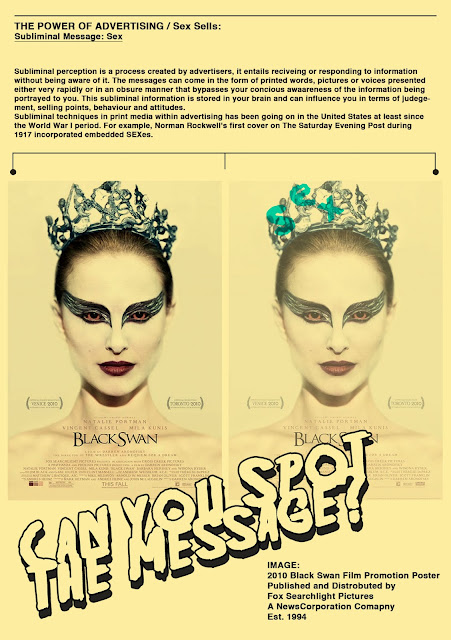
from the research i carried out i found that subliminal messages often promote sex and therefore creates a major selling point. I have selected 2 designs that create subliminal messages by spelling out sex hidden in the image.
The design is once again very simple and i have duplicated the image so that you can see it in it's real contact then with the hidden code on which i have highlighted in a green tone. The designs carry out the same theme and colour scheme to the above a2 designs, as i wanted to keep the designs similar.
Black Swan Poster - FoxSearchlight Productions - 2010
Farrah Fawcett 1976 - Bruce Mcbroom:
I have once again chosen very iconic images that generate a lot of press and media attention and both sold extremely well so the advertisers ideas worked. I chose to also paste a large type across the images to enhance the deisgn and create a relationship and interactive format with the audience.


So what if the word "sex" is in the picture. How is that a subliminal message?
ReplyDelete