Lookbook Layouts:

I like the way negaitve space works within this image. Slight text under the image works well and grid methods allows for a mixed up structure that still looks organised.

Using photgrpah on A4 babsis and no text. The use of extremly limited text looks effective and allows for the minimilist approach.
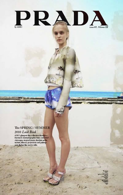
Front cover design: I feel that the paragraphs of type work well in contrast with the image. The left aligned and right aligned type works well and the bold type as a title is good to grab attention.

Creating frames around the image works well. Formal type such as new roamn makes teh peice look preffesional not to 'hipster'. It adds elemnts os sophistcaion and class.
I feel that all these designs work well to portray a traditional minial lookbook. We want the deisgns to feature little text and focus mainly on the image which we will get from the ted baker autum winter collection.
Best features:
Minimal
Aligned
negative space
I feel that i should really work on these point as they seem traditional points and would make the deisgns look simple clean and clear.
No comments:
Post a Comment