Application Design:

Application design for the product would be interesting if block colouring could work and simplify the application for the target audience. Te use of using two - three colours would be useful as you can separate sections of the concept within the application.
The image above works well for this. The use of splitting the app into sections with colour allows for a unique apprach.

This application is effective. Using nright colours attracts audiences. Bold type such as that used in the above image also works well. Maybe a different colour other then white to stand against the background would look effect.
Imagerey is a nice way to intise people in, but on an app that is image based on symbolism it might look too complex and busy.
I also like the idea of using symbols to create the product or use layers / sectioning to pin point areas.


The colour idea for me is quite important. i like using bold formats and strong colours that can grab an audience attention.
I quite like the use of symbols also. Using the black symbol onto a colour. Balck text is also appropriate.
Mnay of teh aplication I have focused my ideas on look quite simple and have easy navigation:
Navigation:
Methods of navigation for app users, circleing main areas of touch screen. The app uses event selection to organise the homepage.

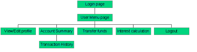
Login page is the main section of application design:
Followed by user specifics.
It is useful to develop these section designs for refrences and layout design of specific sections.

Colour specifics for the application.
User interface elements, control and diverse sectioning.
The use of all the pages linking bac to eachother is effective, i think that i will link the homepage to every other app page. This should enhance navigation and make the app easier to use.

Creating a brand across all the app sections is effective. The colour scheme should match each section of the design and create a co-ensiding theme throughout.

With most of these app the main screen is the homepage and each page has specific section boxes. Creating the box outline needs to be scaled so that it is touch sensetive.

Through browsing these applications I feel that they develop a sense of professionalism throughout. The mocking up of designs is simple and very clear. Sections of the app and ither pages are easy to find and use.
No comments:
Post a Comment