From Wikipedia, the free encyclopaedia - http://en.wikipedia.org/wiki/Information_graphics
Information graphics or infographics are graphic visual representations of information, data or knowledge. These graphics present complex information quickly and clearly,[1] such as in signs, maps, journalism, technical writing, and education. With an information graphic, computer scientists, mathematicians, and statisticians develop and communicate concepts using a single symbol to process information.
EARLY INFORMATION - GRAPHICS:
In prehistory, early humans created the first information graphics: cave paintings and later maps. Map-making began several millennia before writing, and the map atÇatalhöyük dates from around 7500 BCE. Later icons were used to keep records of cattle and stock. The Indians of Mesoamerica used imagery to depict the journeys of past generations. Illegible on their own, they served as a supportive element to memory and storytelling.

In 1626 Christopher Scheiner published the Rosa Ursina sive Sol which used a variety of graphics to reveal his astronomical research on the sun. He used a series of images to explain the rotation of the sun over time (by tracking sunspots).
In 1786, William Playfair published the first data graphs in his book The Commercial and Political Atlas. The book is filled with statistical graphs, bar charts, line graphs and histograms, that represent the economy of 18th century England. In 1801 Playfair introduced the firstarea chart and pie chart in Statistical Breviary.[2]
In 1857, English nurse Florence Nightingale used information graphics persuading Queen Victoria to improve conditions in military hospitals, principally the Coxcomb chart, a combination of stacked bar and pie charts, depicting the number and causes of deaths during each month of the Crimean War.
1861 saw the release of a seminal information graphic on the subject of Napoleon's disastrous march on Moscow.

The creator, Charles Joseph Minard, captured four different changing variables that contributed to the failure, in a single two-dimensional image: the army's direction as they traveled, the location the troops passed through, the size of the army as troops died from hunger and wounds, and the freezing temperatures they experienced.
James Joseph Sylvester introduced the term "graph" in 1878 and published a set of diagrams showing the relationship between chemical bonds and mathematical properties. These were also the first mathematic graphs.
[edit]The development of a visual language in the 20th century
In 1936 Otto Neurath introduced a system of pictographs intended to function as an international visual or picture language. Isotype included a set of stylized human figures which were the basis for the ubiquitous modern stick figures.
In 1942 Isidore Isou published the Lettrist manifesto.
In 1958 Stephen Toulmin proposed a graphical argument model that became influential in argumentation theory and its applications.
The 1972 Munich Olympics were the venue for Otl Aicher to introduce a new set of pictograms that proved to be extremely popular, and influenced the ubiquitous modern stick figures used in public signs.

Also in 1972 the Pioneer Plaque was launched into space with the Pioneer 10 probe. Inscribed into the plaque was an information graphic intended as a kind of interstellar message in a bottle, designed by Carl Sagan and Frank Drake. The message is unique in that it is intended to be understood byextraterrestrial beings who would share no common language with humans. It depicts a picture of a man and a woman standing in front of a simplified silhouette of the probe in order to give a sense of scale. It also contains a map locating the sun relative to a number of pulsars, and a simplified depiction of the solar system, with the probe's path from earth into outer space shown with an arrow.
2005–Present day. The information graphic trend starts to become popular amongst the larger social media aggregation sites Digg Reddit. The data contained in modern info graphics tends to be research centric and attributed to multiple sources.
With the popularity of the information graphics continuing to grow, see google search trends, many internet marketing companies use this to generate viral content that web users will share freely.
http://www.viget.com/inspire/infographics-galore/
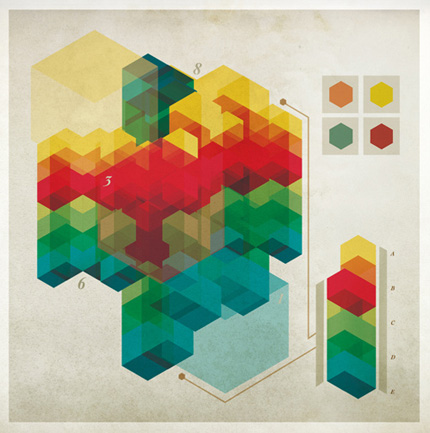


THE EXAMPLES I HAVE COLLECTED ARE QUITE STYLISH FOR INFOR GRAPHICS. I FEEL THE USE OF TEXTURE, SHAPE, SYMBOLS AND COLOUR STROKES LOOK VERY EFFECTIVE IN PORTRAYING INFORMATION CLEARLY AND VISIBLY.
SOME OF MY FAVOURITE DESIGNS CONSIST OF SHAPES SUCH AS :
- LINES
- SQUARES
- RECTANGLES
- CIRCLES
- TRIANGLES
- HETEGONS
THE USE OF CREATING SECTORS FROM THE CIRCLES AND CREATING A TEXTURE BACKGROUND ALLOWS THE IMAGE TO BECOME QUITE 'VINTAGE' LOOKING WHICH TIES IN WELL WITH THE OLD DESIGNS I FOUND WHILST LOOKING THROUGH WIKIPEDIA.
No comments:
Post a Comment