In prehistory, early humans created the first information graphics: cave paintings and later maps. Map-making began several millennia before writing, and the map atÇatalhöyük dates from around 7500 BCE. Later icons were used to keep records of cattle and stock. The Indians of Mesoamerica used imagery to depict the journeys of past generations. Illegible on their own, they served as a supportive element to memory and storytelling.
In 1626 Christopher Scheiner published the Rosa Ursina sive Sol which used a variety of graphics to reveal his astronomical research on the sun. He used a series of images to explain the rotation of the sun over time (by tracking sunspots).
In 1786, William Playfair published the first data graphs in his book The Commercial and Political Atlas. The book is filled with statistical graphs, bar charts, line graphs and histograms, that represent the economy of 18th century England. In 1801 Playfair introduced the firstarea chart and pie chart in Statistical Breviary.[2]
In 1857, English nurse Florence Nightingale used information graphics persuading Queen Victoria to improve conditions in military hospitals, principally the Coxcomb chart, a combination of stacked bar and pie charts, depicting the number and causes of deaths during each month of the Crimean War.
1861 saw the release of a seminal information graphic on the subject of Napoleon's disastrous march on Moscow.
The creator, Charles Joseph Minard, captured four different changing variables that contributed to the failure, in a single two-dimensional image: the army's direction as they traveled, the location the troops passed through, the size of the army as troops died from hunger and wounds, and the freezing temperatures they experienced.
James Joseph Sylvester introduced the term "graph" in 1878 and published a set of diagrams showing the relationship between chemical bonds and mathematical properties. These were also the first mathematic graphs.
[edit]The development of a visual language in the 20th century
In 1936 Otto Neurath introduced a system of pictographs intended to function as an international visual or picture language. Isotype included a set of stylized human figures which were the basis for the ubiquitous modern stick figures.
The 1972 Munich Olympics were the venue for Otl Aicher to introduce a new set of pictograms that proved to be extremely popular, and influenced the ubiquitous modern stick figures used in public signs.
Also in 1972 the Pioneer Plaque was launched into space with the Pioneer 10 probe. Inscribed into the plaque was an information graphic intended as a kind of interstellar message in a bottle, designed by Carl Sagan and Frank Drake. The message is unique in that it is intended to be understood byextraterrestrial beings who would share no common language with humans. It depicts a picture of a man and a woman standing in front of a simplified silhouette of the probe in order to give a sense of scale. It also contains a map locating the sun relative to a number of pulsars, and a simplified depiction of the solar system, with the probe's path from earth into outer space shown with an arrow.
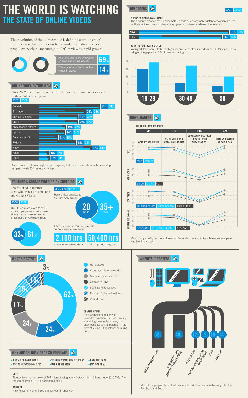
2005–Present day. The information graphic trend starts to become popular amongst the larger social media aggregation sites DiggReddit. The data contained in modern info graphics tends to be research centric and attributed to multiple sources.
With the popularity of the information graphics continuing to grow, see google search trends, many internet marketing companies use this to generate viral content that web users will share freely.
MODERN DAY INFORMATION GRAPHICS :
http://www.viget.com/inspire/infographics-galore/
THE EXAMPLES I HAVE COLLECTED ARE QUITE STYLISH FOR INFOR GRAPHICS. I FEEL THE USE OF TEXTURE, SHAPE, SYMBOLS AND COLOUR STROKES LOOK VERY EFFECTIVE IN PORTRAYING INFORMATION CLEARLY AND VISIBLY.
SOME OF MY FAVOURITE DESIGNS CONSIST OF SHAPES SUCH AS :
LINES
SQUARES
RECTANGLES
CIRCLES
TRIANGLES
HETEGONS
THE USE OF CREATING SECTORS FROM THE CIRCLES AND CREATING A TEXTURE BACKGROUND ALLOWS THE IMAGE TO BECOME QUITE 'VINTAGE' LOOKING WHICH TIES IN WELL WITH THE OLD DESIGNS I FOUND WHILST LOOKING THROUGH WIKIPEDIA.
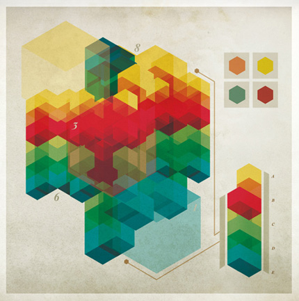
FOR THIS TASK WE HAVE TO PICK IMAGES TO WHICH WE FEEL ARE AESTHETICALLY PLEASING TO US AS AN INDIVIDUAL. HERE ARE THE IMAGES I SELECTED:
WHY ARE AESTHETICS IMPORTANT?
Attracts peoples attentions to the design or image.Preference/taste.Isolating a target audience.Sustain someone interest.Appearance of a application.Give a certain amount of visual pleasure.Emotive response.Something that makes us human.Defining ourself as a race separate from animals.How we appreciate something.Helps gives value of an object or image.
5 MOST IMPORTANT AESTHETIC QUALITIES TO ME:
SIMPLICITY
COLOUR
LAYOUT
UNIQUE
ANGULAR
We were then put into partners and swapped or 5 most important athletic qualities, i was working with Sam and his aesthetic qualities were:
STRONG
COLOURFUL
VISUAL SHAPES
LAYOUT
TEXTURE
We were set the task to go away and in the time we were given to find books in the library of images that relate/conect to the aesthetic qualities that my partner had given me.
I FOUND THESE IMAGES THAT I THOUGHT SAM WOULD APPRECIATE AND WOULD FUL FULL HIS QUALITIES:
GAINING OPINIONS ON OTHER PEOPLES WORK AND OUR IDEAS. ALLOWS YOU TO VIEW AND USE COMPARATIVE TECHNIQUES TO COMPARE WORK IN VARIOUS WAYS. IF YOUR DESIGN IS WRONG/ NEEDS ADDED EFFECTS THEN USING A CRIT CAN BE HELPFUL IN GAININ IDEAS. IT GIVES YOU A DIFFERENT PERSPECTIVE AND CAN BE USED IN MANY WAYS SUCH AS VERBAL OR CREATIVE. FROM THE TASK THESE ARE WHAT WE SAID A CRIT WAS: Widen our perspective and point of view of others work.Improve standard of work and how to look at others work.Helping us present our ideas.Allow us to share our opinions with our peers.Leading us in the right direction.makes us more confident in show off our work and ideas.Presenting our work correctly so we can get the most out of our designs and share these with everyone else.
WE GOT TAUGHT THE DIFFERENT WAYS TO CRIT AND UNDERSTAND AND TAKE CRITICISM. WE GOT TAUGHT TH TERM
D I E T :
Diet is the method of critiquing something correctly. This Stands for different ways to analysis a piece of work so it is examined and understood properly.
D=Discribing
I= Interpreting
E= evaluating
T= Theorising
D=What is it? and What does it mean?
I=What does it do?
E=How good/How effective is it?
T=Does it solve the problem?
USEING THIS PIECE OF WORK BELOW I CAN THEN START TO PRACTICE A GOOD CRIT METHOD:
http://www.google.co.uk
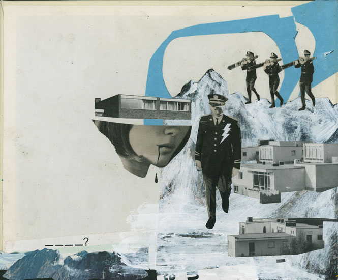
MARIO WAGNER -
THIS PIECE IS A COLLAGE OF VISUAL AND ILLUSTRATIONAL TECHNIQUES. IT CREATES AN AESTHETICALLY PLEASING COLLAGE BUT ALSO ADDS IN THOUGHT PROVOKING SUBSTANCES.
I FEEL THAT THE IMAGE IS TRYING TO PORTRAY THE 'COLD WAR' AND THE RELATIONSHIP WAR HAD ON PEOPLE AND PLACES.
THE IMAGE AS A WHOLE IS SIMPLE BUT EFFECTIVE. I FEEL THAT IT DEVELOPS WHAT IT IS TRYING TO PORTRAY IN AN INTERESTING WAY.
QUESTIONS TO ASK:
What is the most boring thing?What will be the most interesting thing to learn about this work?Why the use of colours?Why is it not detailed?Why is parts of the image filled in colour and the hand is an outline?Why is the tough the only colour within the image?
List one thing YOU already now about the work?
What is the most interesting way to find out information about the work?
WHY DID YOU DESIGN THE COLLAGE THIS WAY?
WHAT MADE YOU CHOSE TO DEVLOP THE WOMAN AS A CENTRAL FOCUS? DOES IT CONVEY HIDDEN MEANINGS?
HOW = AND WHEN IS THIS COLLAGE MEANT TO BE PERCEIVED?
Caves at Lascaux, FranceImages which has been starched into a cave wall.Drawing and paintings on cave walls from the Paleolithic period (17,300 year old).Discovered in 1940 by four teenagers.Depicting scenes of everyday life, hunting etc.Scratched in the walls with animal bones.Re-telling stories of the day.
ROMAN GRAFFITI - SCRATCHES AND MARKS FROM THE HUMAN FIGURE LOOK QUITE EFFECTIVE. IN MY OWN PERSONAL OPINION O DON'T FEEL THAT THIS IS GRAFFITI. THE USE OF USING A WALL ADDS A LITTLE, BUT THATS MAINLY BECAUSE THERE WHERE HARDLY ANYTHING TO WRITE ON AT THAT PERIOD.
20th century graffiti,
Caricature of a politician.Cartoon style drawing seems simple. If you look at features it seems to be mocking the figure as exaggerated chin and nose and forehead portrays. The drawing looks quite comical in some respects which does link to graffiti as that is meant to be seen as expression.
1970'S GRAFFITI STYLE - NYC:
http://www.youtube.com/watch?v=xRbRc3ZeORw
http://www.youtube.com/watch?v=Nz8tOK8_NGg
THESE VIDEOS HELP TO EXPLAIN THE CULTURAL AND VISUAL ASPECTS OF URBAN GRAFFITI AT THAT TIME AND HOW IT INFLUENCED PEOPLES EXPRESSIONISTIC WAYS THE WHEREABOUTS OF BUILDING DRAWN ON ECT. FROM GANGS TO THE WAY THEY WORKED AND HOW GRAFFITI HELPED TO DEVLOP A BETTER SOCIETY IN DIFFERENT ASPECTS.
http://www.google.co.uk
Constant painting on railways and then the constant clean upPolitical statements, announcing presenceNewyork suburb at the timeMaking language of the streets visible.
Basquiat claims the name was first developed in a stoned conversation with high school friend Al Diaz, calling the marijuana they smoked “the same old shit,” then shortening the phrase to "Same Old", then "SAMO".[1] The character of SAMO was first developed by Basquiat, Diaz, and Shannon Dawson (artist) while they were fellow students at City As School high school. Basquiat took the lead in creating a character called SAMO, selling a false religion, in comics made in high school. The concept was further developed in a theatre-as-therapy course in upper Manhattan (called “Family Life”) that was used by the trio as part of the City As School program. "Jean started elaborating on the idea and I began putting my thoughts into it," remembered Diaz.[2] Basquiat, Diaz, Shannon Dawson and Matt Kelly worked on a comic style endorsement of the false religion, photocopied as a pamphlet “Based on an original concept by Jean Basquiat and Al Diaz.”[3]
The City As School 1977-8 Yearbook includes a photo of the SAMO graffiti: SAMO@ AS AN ALTERNATIVE TO PLASTIC FOOD STANDS…
Henry Flynt claims that Shannon Dawson (later of the band Konk) played a major part in the trio of writers in the first wave SAMO graffiti writers,[4] but most accounts, including those of Basquiat, claim the writing was done by the duo of Basquiat and Diaz.[3] When asked about other people, Basquiat said “No, No, it was me and Al Diaz.”[5] Basquiat remembers writing the tag with marker on the subway on the way back from Manhattan to Brooklyn, where he lived as a high school student, but unlike most of the graffiti taggers of the time, SAMO was primarily written on walls, not subway trains.
Al Diaz graduated from City As School in 1978, and Basquiat dropped out of school and left his father’s home in Brooklyn to spend time homeless and living with friends in Manhattan in June of that year. From that point the SAMO graffiti took off in lower Manhattan. SoHo, parts of East Village, and the area immediately around the School of Visual Arts were prime targets for the Graffiti.
Diaz had been a young and early member of the New York graffiti scene of the 1970s, and his tag “Bomb I” was included in Norman Mailer’s famous book The Faith of Graffiti in 1974.[6]
By late 1978 the two were using spray paint to quickly get up larger phrases. “We would take turns coming up with the sayings” said Al Diaz.[3] Many of these retained the same ideas as the comic strip SAMO of high school:
Jean-Michel Basquiat artist who represented the contemporary art scene of the 1980s more then anyone at that timeHe came to be known anomanously from been a homeless graffiti artistHe is known for spraying cryptic social messages on building walls around the City of New York.Began painting SAMO graffiti messages on walls around SoHo, 1977.He also collaborated with artist like Andy Warhol, David Bowie, he even dated Madonna for a short time.Andy Warhol then died in 1987, Feburary 22.
http://www.google.co.uk
Warhol and Basquait - Basquiat collaborated with Warhol General electric with waiter, 1984Critique of capitalism One of Americas largest corporationswhen Basquiat short died after Warhol that was known as the end of new york art scene in the 80s.
Keith Haring, radiant baby,1990
SAMO MOVED STYLE TO PAINTING.
STILL IN KEEPING WITH GRAFFITI STYLE - METHODS SUCH AS BRIGHT COLOURS/ QUICK PENCIL MARKS ETC.
Keith Haring, Subway drawing:
In 1981 he sketched his first chalk drawing on lack paper and painted plastic, metal and found objects.His work had a kind of DIY element using objects to create his workIn 1984 he visited Australia and painted wall murals in MelborneHe created his drawing in places like subway satins using materials already there
Influenced by subway graffiti on trains such as the Urban graffiti in 1970s."I immediately knew that I had to go above ground and buy chalk."-Haring, from interviews by John GruenMuch like And Warhol, he used Bold lines, Bright colours and simple subjects.His drawing show what he thought about racisum,gay rights and all political subjects.He has left his mark on pop art cultureI think hat his drawing were mostly remembered and admired from the simplicity of understanding the message through his unique use of bold,bright imagery.
John Feckner,Broken Promises,1980
BANKSY
http://www.banksy.co.uk/newoutdoors/outdoors.html
www.wikipedia.co.uk
Banksy is a pseudonymous England-based graffiti artist, political activist, film director, and painter.
His satiricalstreet art and subversive epigrams combine irreverent dark humour with graffiti done in a distinctive stencilling technique. Such artistic works of political and social commentary have been featured on streets, walls, and bridges of cities throughout the world.[1]
Banksy's work was born out of the Bristol underground scene which involved collaborations between artists and musicians.[2] According to author and graphic designer Tristan Manco and the book Home Sweet Home, Banksy "was born in 1974 and raised in Bristol, England.[3] The son of a photocopier technician, he trained as a butcher but became involved in graffiti during the great Bristol aerosol boom of the late 1980s."[4] Observers have noted that his style is similar to Blek le Rat, who began to work with stencils in 1981 in Paris and members of the anarcho-punk band Crass, which maintained a graffiti stencil campaign on the London Tube System in the late 1970s and early 1980s and is active today.[5][6][7]
Known for his contempt for the government in labeling graffiti as vandalism, Banksy displays his art on public surfaces such as walls and even going as far as to build physical prop pieces. Banksy does not sell photos of street graffiti directly himself;[8][9] however, art auctioneers have been known to attempt to sell his street art on location and leave the problem of its removal in the hands of the winning bidder.[10] Banksy's first film, Exit Through the Gift Shop, billed as "the world's first street art disaster movie," made its debut at the 2010 Sundance Film Festival.[11] The film was released in the UK on 5 March 2010.[12] In January 2011, he was nominated for the Academy Award for Best Documentary for the film.